Blue Conference
Identity + Print Design
Role: Collaborative team member — theme development, brand identity, layout design, production
Organization: Fairfax Community Church
Every year, Blue Conference had a new theme. And every year, that meant starting fresh — building a visual identity that could carry a full weekend experience for 500 attendees across every printed touchpoint.
For this iteration, I was part of the team that collaborated to land on the theme: technology in a changing culture. The retro aesthetic that emerged from that conversation — static textures, bold type, grid-based layouts — wasn't decoration. It was a way of making the tension between old and new feel tangible from the moment someone picked up the booklet.
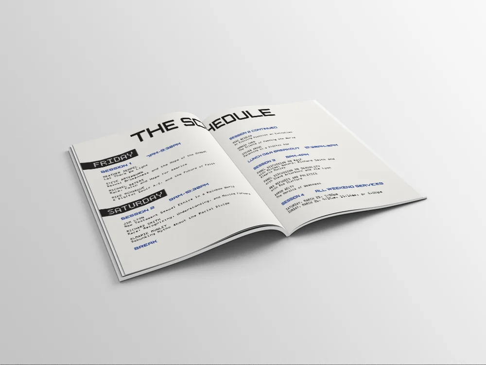
But the booklet had a job to do beyond looking cohesive with the conference environment. Five hundred people were going to carry it through a full weekend of sessions. They needed to find what they were looking for quickly, follow the schedule across multiple days, and have somewhere to actually capture what they were learning. That last part shaped two of the most deliberate decisions in the design: building dedicated note-taking space directly into the layout, and specifying uncoated paper for the print run so attendees could write in it without ink smearing or sliding off the page.
I coordinated with the conference planner to gather all content and speaker information, worked with a coworker to ensure session descriptions were consistent in tone and length, and managed the file through to final print production — including catching and resolving a printing error after the booklets arrived to ensure they were delivered on time.
When the conference ran, I watched people use it. That was the moment that mattered — seeing someone flip to the schedule, find their session, and write something down in the margin.